

Intro
A few years ago I built a target visualization using a donut chart. To this day, it's still a popular blogpost! But... the downside of using a donut is having to prep/model the data outside of Data Studio.
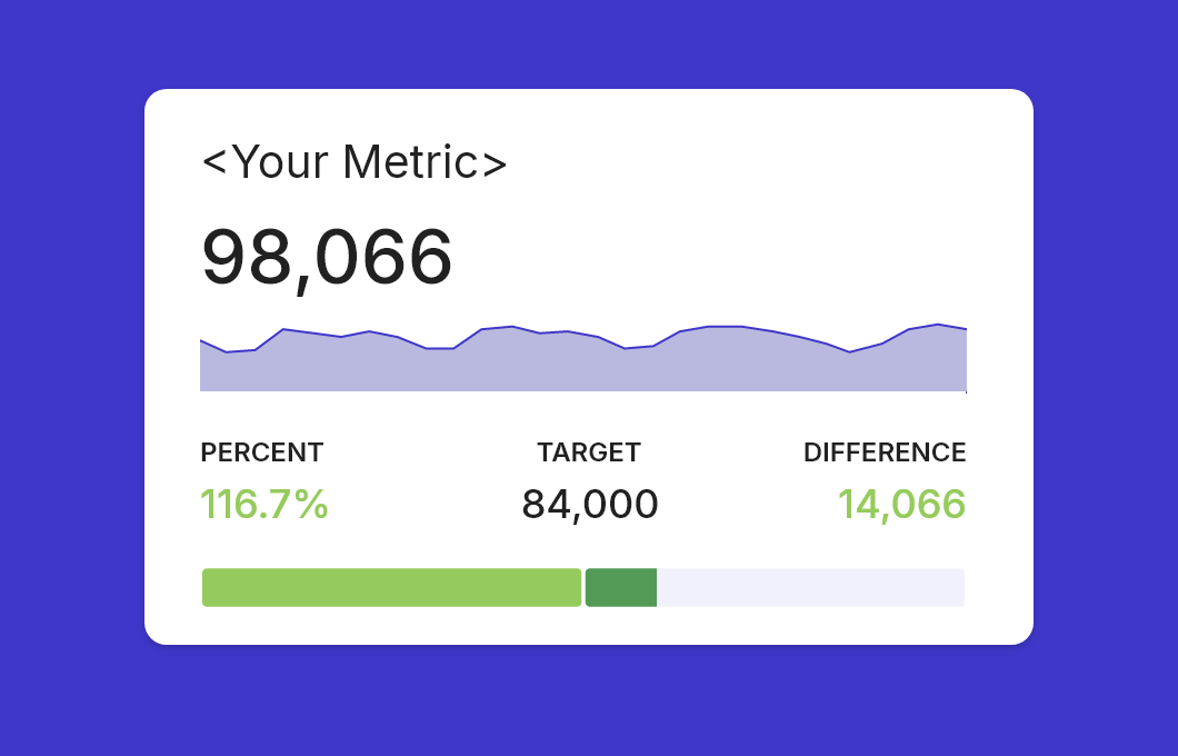
This blogpost offers another approach on visualizing progress toward a target, but fully native to Data Studio. We will use a 100% stacked bar chart with color-coded metrics which we will build using calculated fields.
Free Example Report
I made an example report that you can view, or copy and edit, to follow along this blogpost and dive into the details. Go to example report
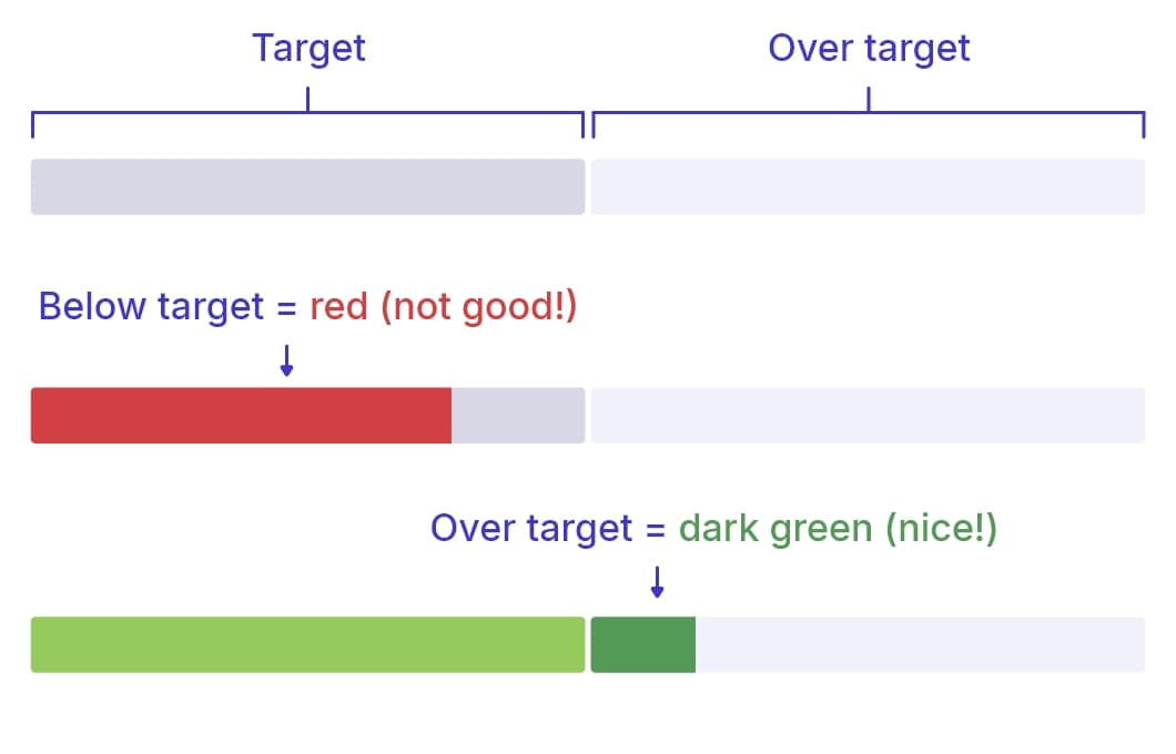
The target viz is basically two equal parts. The first half resembles the set target. The actual is red until it hits target. If it hasn't yet, the remaining part of the first half is shown in dark gray. Once you've hit the target, the first half turns green, and the second half comes into play. This shows the part over the target in a dark green color. The visualization will show up to a max of 100% over target. If that happens, you're either having a good run or you have set your target too low.
In this tutorial, we're working with GA4 data, and we are building the target graph for the Sessions metric. However, the same steps apply to any data source or metric. Other example metrics would be revenue, leads, or, with some adjustments, even a percentage.
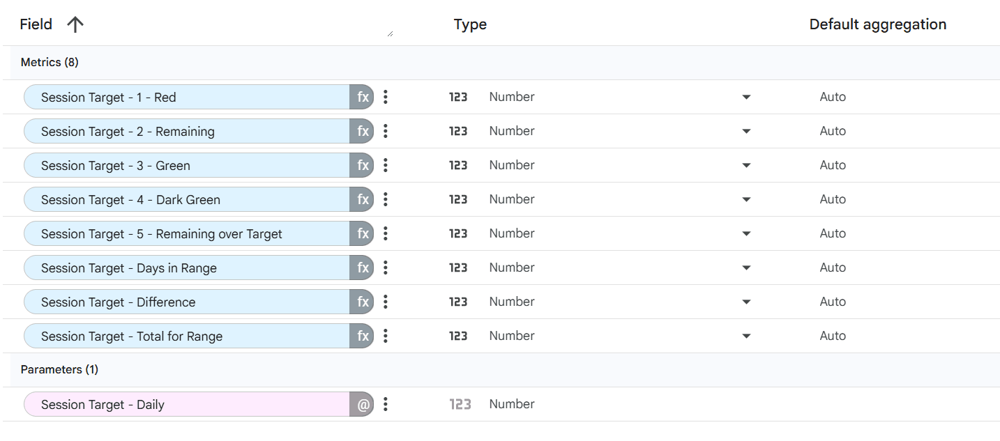
We will build a total of 9 fields: 4 of these fields are there to support the calculations, the other 5 will be used as metrics in the actual graph.
- Parameter - Daily target
- Supporting field - Days in Range
- Supporting field - Difference
- Supporting field - Total for Range
- Metric 1 - Under target (color: red)
- Metric 2 - Remaining to target (color: dark gray)
- Metric 3 - Exactly on target (color: green)
- Metric 4 - Over target (color: dark green)
- Metric 5 - Remaining over Target (color: light gray)
One important limitation upfront: this approach supports up to 100% over target (a maximum of 200% total). The bar chart is split into two 100% halves, so values beyond +100% won't display fully in the chart. The accompanying numeric metrics will still be accurate, but the visual won't expand further. There are a couple of other limitations mentioned on the bottom of this blog.
Part 1: Create the Target
First step: creating the target metric. This will be used across the logic in the next steps. We will create this as a Parameter. This way, people who are using your report can interact with the target visualization by entering their own data. You can see this in action in the example report in this blog. Try changing the target number using the Input field, and the charts will adapt. If you don't want your users to move the goalpost (which makes sense), you can leave the control field(s) out of the report.
- Click Resource in the menu bar
- Click Manage added data sources
- Click Edit on the data source where the metric for the target lives.
- Click Add a parameter
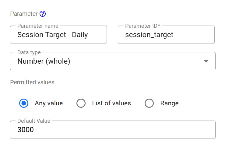
- Give the parameter a name. I used
Session Target - Daily. If you plan to build multiple targets, you need to be able to separate them, hence the 'Session' prefix. - For Data type, pick Number (whole)
- Select Any value
- Enter your target value.
One important thing to note here: we are setting a daily target. This allows us to calculate the target for multiple date ranges. This way, it doesn't matter if a user selects one week, a full month, or a random 60 days... the target will adjust. This does mean you have to find an average daily target that reflects your month, quarterly, or yearly target(s).
Part 2: Supporting Fields
In this section, we will build 3 calculated fields that will support the calculation of the metrics needed for the graph.
- The number of days in the current range
- A total target for the current range (number of days multiplied by the daily target)
- A difference between the total target and the actual
Days in range
This field calculates the number of days in the current date range. We need this to calculate the total target for the selected date range. Whether you have set your report to a default range and users can't change it, or you have embedded a Date Range control in your report, this field will give you the number of days.
- While in edit mode on your data source, click Add a field, and then pick Add calculated field.
- Give your field a name. I used
Days in Range - Enter the below formula and click Save
DATE_DIFF(MAX(Date),MIN(Date))+1
This calculates the number of days between the two dates in the range > MAX and MIN. To include the current day in our calculations, we add +1 at the end.
Total target for Range
This field calculates the total target for the current date range. Remember, our target parameter is set on a daily target. This field will multiply the daily target by the number of days in the range.
- Again, click Add a field, and then pick Add calculated field.
- Give your field a name. I used
Session Target - Total for Range - Enter the below formula and click Save
Session Target - Daily*Days in Range
The field names should turn into colored labels. If this is not the case, please check the field names.
Difference between Target and Actual
This field calculates the difference between the actual and the total target. This calculation can't be done within the formulas for the other metric fields, so we have to pre-calculate.
- Again, click Add a field, and then pick Add calculated field.
- Give your field a name. I used
Session Target - Difference - Enter the below formula and click Save. Replace
Sessionsfor the metric you are using!
Sessions-Session Target - Total for Range
Now that we have the 3 supporting fields done, we're ready for the fields that will build the actual visualization.
Part 3: The Calculated Metrics
In this chapter we will build the actual metrics used in the Stacked Bar chart target visualization. These are:
- Metric 1 - Under target
- Metric 2 - Remaining to target
- Metric 3 - Exactly on target
- Metric 4 - Over target
- Metric 5 - Remaining over Target
If you plan to build multiple targets, you need to be able to separate them. I opted to prefix the metric name, for example 'Session Target - 1 Under Target'. In the end, you're free to use whatever naming convention you prefer. The rest of this blog will follow the above naming convention.
Metric 1 - Under target
This metric will become the red bar while the actual number is performing under the target.
IF(Sessions < Session Target - Total for Range, Sessions, 0)

In plain English: IF the actual is below the total target, THEN return the current actual, ELSE return 0. Basically, it shows the current actual ONLY if it's below target. Once on or over target, it returns zero, because we don't want to show the red bar if we've hit the target.
Metric 2 - Remaining to target
This field will calculate the remaining amount between the actual and the total target. This will become the dark gray bar of the first half of the target viz.
IF(Sessions < Session Target - Total for Range, Session Target - Total for Range-Sessions, 0)

In plain English: IF the actual is below the total target, THEN return the total target MINUS the actual, ELSE return 0. Again, this bar only shows if the actual is below target, if not, we hide it by setting it to zero.
Metric 3 - Exactly on target
Once our actual hits the target, we want the first half of the target viz to show green. But nothing more, as the part that's over target we'll show in a darker shade of green.
IF(Sessions >= Session Target - Total for Range, Session Target - Total for Range, 0)

Again, in plain English: IF the actual is HIGHER (>) or EQUAL (=) to our target, return our target, ELSE return 0. So when the target is hit, this metric will show just that target, nothing more, nothing less.
Metric 4 - Over target
Almost there! This field will show up to 100% over target in the darker shade of green, in the second half of the visualization.
IF(Sessions > Session Target - Total for Range, NARY_MIN(Sessions-Session Target - Total for Range, Session Target - Total for Range), 0)

Plain English: IF the actual is higher than the total target, THEN return the LOWEST (NARY_MIN) of these metrics (Actual MINUS Total Target OR Total Target), ELSE, return 0. The NARY_MIN part is there to make sure the graph doesn't break above 100% over target. If that happens, the lower number will be the total target, making sure the second bar stays filled. If we wouldn't do this, the stacked bar chart would no longer be two halves and the viz would break.
Metric 5 - Remaining over Target
Bear with me, because this last field might look scary, but it's actually quite simple. It's the last metric in our stacked bar chart. It will show the light gray in the second half, which shrinks once you've hit the target and keeps the chart at 2 halves. We're using nested IF-statements for this one.
IF(Sessions > Session Target - Total for Range AND Sessions < 2*Session Target - Total for Range, Session Target - Total for Range-(Sessions-Session Target - Total for Range),
IF(Sessions < Session Target - Total for Range, Session Target - Total for Range,
IF(Sessions >= 2*Session Target - Total for Range, 0, 0)
))

In Plain English:
- IF the actual is HIGHER (>) than the total target, AND the actual is BELOW (<) 2X the total target, THEN return the total target MINUS (Actual MINUS total target),
- ELSE IF the actual is LOWER (<) than the total target, return the total target,
- ELSE IF the actual is HIGHER (>) 2X the total target, return 0, ELSE return 0.
Now that we have all 5 metrics, we can move on to setting up the stacked bar chart.
Part 4: Building the Visualization
We are using the 100% stacked bar chart for this visualization.
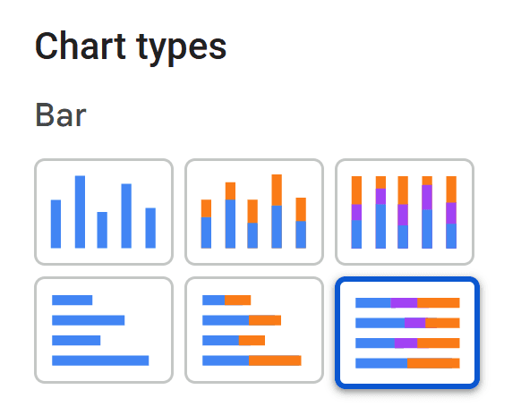
Place the chart on the desired position on your canvas and scale it to fit your purpose. In my example, the chart is 40px high.
Go ahead and apply these settings on the chart:
- Tab: Setup
- Select your Data Source
- The dimension axis can be something generic, like
Event name. - On the Metric axis, set these metrics in this exact order
- Metric 1 - Under target
- Metric 2 - Remaining to target
- Metric 3 - Exactly on target
- Metric 4 - Over target
- Metric 5 - Remaining over Target
- Optional metrics: OFF
- Metric sliders: OFF
- Display: Top N / Number of bars: 1
- Tab: Style
- Show title: OFF
- Horizontal bars
- Group bar width: 100%
- Stacked bars: ON
- 100% stacking: ON
- Show total card: OFF
- Show data labels: OFF
- Bar colors - Feel free to use your brand colors. I used these:
- Metric 1 - #d24044
- Metric 2 - #eceef7
- Metric 3 - #95cb5c
- Metric 4 - #539a56
- Metric 5 - #ffffff
- The rest of the settings can be left to their defaults.
Now you should have a working target visualization like the one in my example report. If you are using the viz in a card like I did, you can add supporting metrics to it.
If something isn't working for you, create a copy of the example Data Studio Report and click the Edit button, so you can compare my setup to yours node by node.
Extra: Prettifying with an image overlay
This step is optional but if you ask me, definitely recommended!
The example report has two variants of the visualization. The one on the right has the image overlay, and in my opinion, looks way more clean. The image is basically a mask of the same background color which has a transparent view-through. This shows the 2 halves/bars and adds rounded corners for a smooth look. It also hides the thin lines that Data Studio shows for the empty metrics (which you can see in the left variant).
You can download the overlay image I'm using here, but it might not fit your specific need. As it's a simple *.svg file, you can fairly easy change the dimensions and color of it. Copy the below SVG code, paste it into Notepad, postfix your name with .svg, set the 'Save as' option to 'All files', and hit Save. You have now created your own SVG image. Or just chuck the below code into your AI assistant and let it adjust it for you.

<svg xmlns="http://www.w3.org/2000/svg" width="420" height="40" viewBox="0 0 420 40">
  <defs>
    <mask id="dsg-windows">
      <rect width="420" height="40" fill="#fff"/>
      <rect x="11"  y="10" width="198" height="20" rx="4" fill="#000"/>
      <rect x="211" y="10" width="198" height="20" rx="4" fill="#000"/>
    </mask>
  </defs>
  <rect width="420" height="40" fill="#f4f6fe" mask="url(#dsg-windows)"/>
</svg>
- Recolor: open the SVG in any text editor, find fill="#f4f6fe" on the bottom rect, and swap in your report's background hex.
- Resize: set width and height on the svg, or just drag the image to size in Data Studio. Leave viewBox alone.
- Align to your bars: the two black rectangles (#000) are the see-through slots. Nudge y/height to match your bar thickness and vertical position, and x/width to match its horizontal span.
Example report in Data Studio
You can see a fully working demo of this visualization on the below link. Select your GA4 data source and set your own target to give it a go with your own data. Feel free to create a copy to dive into the details.
Limitations
As mentioned earlier in this blog, the most important limitation of this target visualization is that it only supports up to 100% over target (a maximum of 200% total). The bar chart is split into two 100% halves, so values beyond +100% won't display fully in the chart. The accompanying numeric metrics will still be accurate, but the visual won't expand further.
The image overlay can be scaled to fit your purpose, but it has its limitations. If you need a different shape altogether, you might have to recreate the image.
When using the image overlay, the hover/tooltip feature of the chart will no longer trigger. Personally, in this case I don't mind because the metrics are displayed above the visualization anyway.
Going down this route with multiple targets across multiple metrics will need you to build a lot of custom metrics, which can be time consuming.